
This is What Your Retention Curve Looks Like
Your free trial length isn't the problem. Activation is.

Free trials are a go-to method for user acquisition in SaaS, and their length can be a hot debate. I’ve seen PMs, designers, and marketers argue about it a dozen times, and the tradeoff is always the same: long enough to put it through its paces, but short enough to add urgency. If it’s too long, it will cannibalize our paid business! If it’s too short, users won’t “get” it. My analysis of the Geekwire 200 shows that of those with free trials, 14 and 30 day trials are the most common offerings.1 Alice Li found that even for a firm with a 30-day trial, users’ conversions to paid happened after a median 9 days.2 It’s nice and tidy to snap to weeks or months, and we usually land on a week or two.
Here’s the uncomfortable truth: in one week you’ve already lost most of them. I don’t know who you are, but I can tell you that your weekly retention curve looks like this:
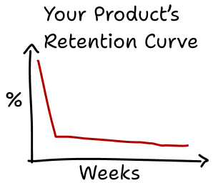
In Mixpanel’s 2024 Benchmarks Report, they reported that the average one-week retention rate was 28%.3 And it’s getting worse; the amount varied by vertical but every industry had a year-over-year decrease in retention. This tracks with Li’s finding that the first day is the modal point for conversions by an order of magnitude. By the end of the trial, it’s too late for most users.
We Need to Go Deeper…
The single-biggest hurdle in a free trial is about time, but it’s not the duration of the trial: it’s the time to the user’s activation. “Activation” is product analytics jargon for the moment a user gets to the moment of value – the “aha” moment that demonstrates why they need what you’re selling. Activation is a matter of minutes, hours, maybe days, but not almost certainly not weeks. Before you worry about habits, cannibalizing your paid business, or any of that, you have to go a layer deeper than retention.
The starting point, if you haven’t already, is to define and measure your funnel. The funnel is like a zoomed-in version of the retention curve. The retention curve measures the funnel’s global, end-to-end transition percent:
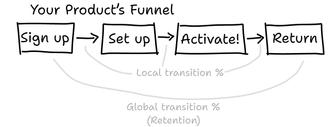
Your global problem is the aggregate of local problems, and the funnel captures local transitions between the four stages.4 Breaking data out in this way provides metrics to optimize, but I think the most productive use of the funnel is actually as a diagnostic tool. Defining and measuring a funnel requires you to be clear about things like:
What’s our product’s moment of value? If you have to distill the new user experience into one “aha” moment that leads to conversion, what would it be?5 How is it measured? Your product has a many meaningful interactions, but trying to make sense of them all at once is overwhelming and rarely yields actionable insight. Start with focus.
What steps are absolutely necessary to get to that moment? As products grow in complexity, their setup processes do too. The funnel provides a lens through which you can focus on what’s most essential, and can give you the confidence you need to defer (or cut!) the rest of the setup process.
How often do you actually expect users to come back? You’ll probably be measuring Daily Active Users, and you should be, but there’s a good chance you don’t expect most users to return every day. Do you expect them to be there within three days? A week? A month?
If you’re looking for a framework to help you get started, I’ve collected some pointers and first-level diagnostics in the Funnel Diagnostic Worksheet. The worksheet is for subscribers only, but I’ve got great news: subscriptions are free!
Two Common Diagnostic Questions
There are loads of diagnostic approaches to take with a funnel, but there are two high-impact questions to start with:
How many steps are in setup? A Userpilot study found that only 81% of users don’t complete their onboarding checklists.6 Remember: your goal is to get them to “aha”. Cut ruthlessly.
What transition has the lowest conversion percent? This is where you have to roll up your sleeves and dig into the data. There are a few questions to ask your data:
Have we seen any changes in conversion percent in the last 30 days? 90 days? Year?
What groups of users are converting well? This can give an enlightening view into your product’s personas, and a pointer for product or UX research.
When they’re not converting, what are they doing instead? Grab your favorite analytics software (or analytics person) and wade into the data marshes. Sam Zaiss wrote a great piece on this. To quote Sam, the common challenges to address at this step are:
The most insightful user paths aren’t the most common, so we need another way to identify that signal amidst all the noise.
The most meaningful events aren’t tracked, because they sit on the seams between features or product teams.
The most common visualizations aren’t designed to let the key insights pop, making them harder to discover.
Sam Zaiss, Deliberate Data Culture
When you view the funnel as a diagnostic tool, it can shine a light on the best places to put your data-savvy folks to work. As you take action on problems, the local transition rates give you a responsive and measurable indicator of progress.
Ready to Dig In?
If you’ve been through the basics and aren’t sure how to go deeper, I’d love to help. Full Rank is a data science consultancy that works with small teams that don’t have full-time data science support. If you complete the Funnel Diagnostic Worksheet, reach out for a free 30-minute consultation.
The Geekwire 200 marketed the following free trial lengths: 7 days (n=3), 14 days (n=10), 30 days (n=9), 60 days (n=1), 90 days (n=1), unspecified (n=9). Based only on the companies that allowed scraping (n=187)
Mean conversion was after 23 days. The distribution is multimodal with a smaller hump after the trial’s endpoint. Keep the denominator in mind here – this is only the people who converted. Li, Alice. (2021). Converting Free Users to Paid Subscribers in the SaaS Context -The Impact of Marketing Touchpoints, Message Content, and Usage. Production and Operations Management. 31. 10.1111/poms.13672.
Mixpanel Benchmarks Report. Based on data from 7,700 Mixpanel customers, 11.7 trillion events.
You may be tempted to add more stages in the middle. Don’t. The most useful funnels are short, clear, and have easily measurable transition points. The more complex your funnel gets, the harder it is to glean meaningful insights. There’s a time for wading into complexity (and it’s discussed in this post), but start with simple. The exceptions are at the beginning and end. If you add “Acquisition”, “Referral”, and “Revenue”, you get Pirate Metrics. These are great additions if you have a good way of mapping leads that eventually sign up to their users.
It’s really important that you approach the moment-of-value as a user-centric question, not a company-centric one. I’ve seen teams decide their moment of value is a flashy new feature, not because it’s the most important to their customer, but because they just spent loads of effort building it.
Userpilot Saas Product Metrics Benchmark 2024. (N=188 companies)